Activation and APD Maps
in this tutorial:
average trace to a single AP
visualize wave front propagation
create activation MAPs
create APD MAPs
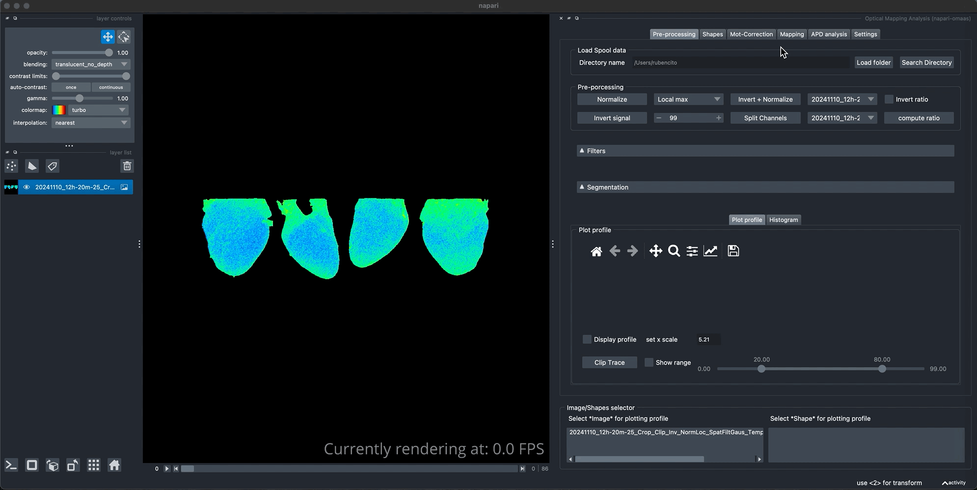
We will start with an image that we have already preprocessed (invert, normalize, clipped to 4 beats, filtered and segmented), such the one we used for computing the APD tutorial from plot profiles.
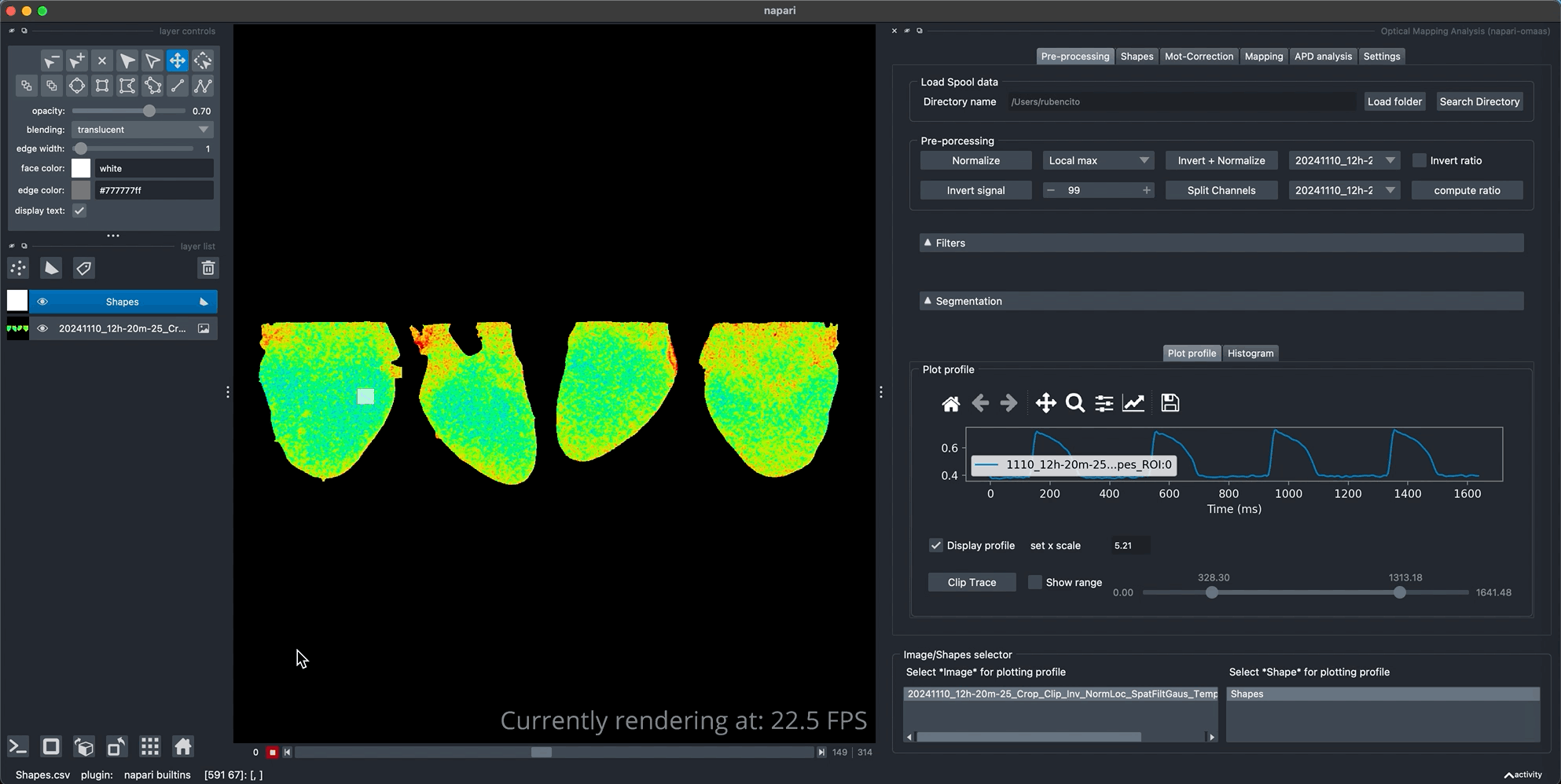
We can observe that in this image the signal contains 4 cardiac cycles. To compute APD maps we need to use a single cardiac cycle. We average these four cardiac cycles in order to obtain a single beat with improved signal. The averaging of the beat can be done with more cardiac cycles if needed.
Average traces
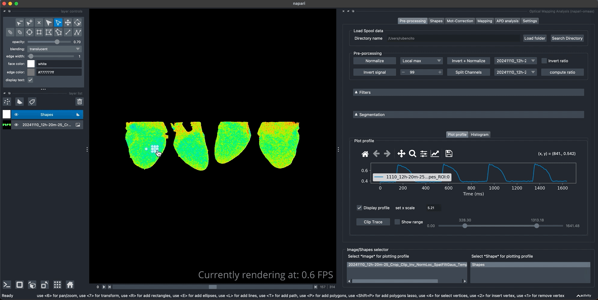
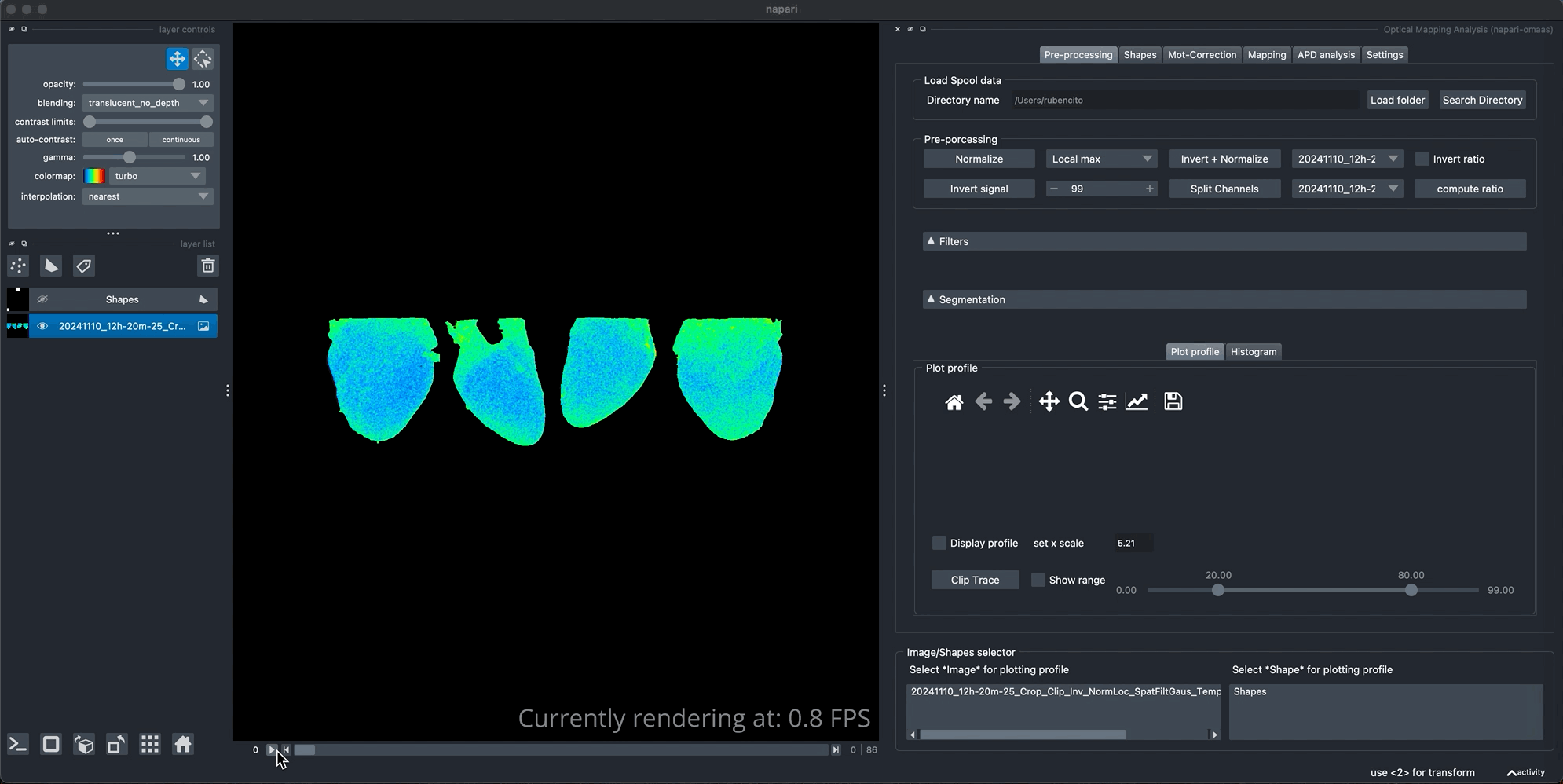
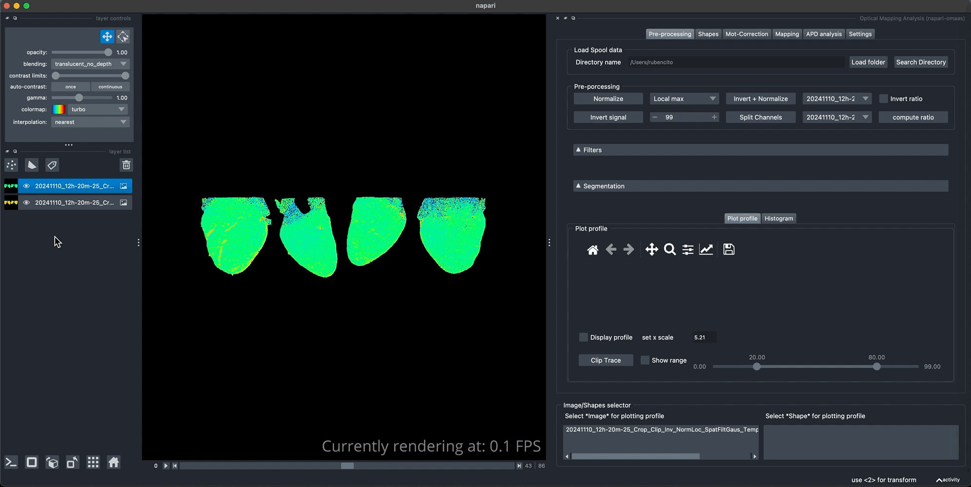
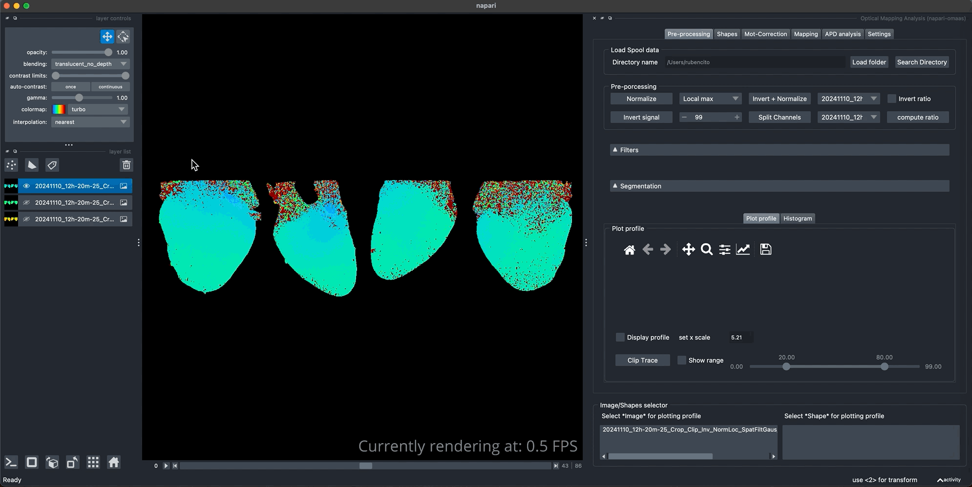
To create a more smoother trace, we first increase the ROI size and plot the profile. The top of the mapping tab contain the tools to split the traces in the different Ap detected, in this case, after clicking on the Preview traces button it will display the four overlay AP detected. You can preview the averaged trace from the current detection. In addition, you can navigate through each of the detected APs and shift them to left or right if the overlay does not seems to match the same starting point (misaligned). When you find the current selection is correct, click the Average traces button to perform the operation. You can visualize the resulting image in the main viewer as displayed bellow.
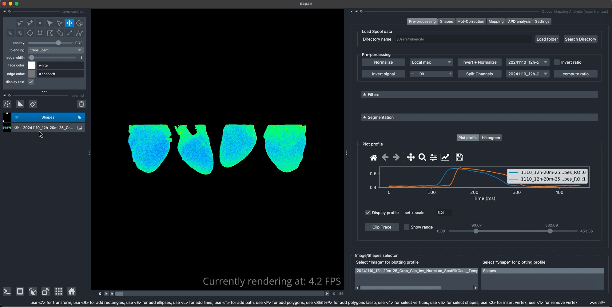
We can from the new averaged image observe for instance the delay from the starting point of the AP propagation at the base of the anterior view to the apex by ploting the profile of the two distant regions as shown bellow.
Visualize wave front propagation
We can compute the first derivative of the single AP video to visualize the upstroke of the AP wave front propagation.
APD maps
We can create APD maps or activation maps by switching to any of the two options as shown bellow. the APD percentage can be adjusted but only is valid for APD maps. We can use
The APD90 map generated can quickly be visualized in the Post-Processing tab for further filtering if the maps are too noisy. Note that the values displayed in the graph on the are expressed in ms.
Activation maps
We can use the same method to compute the activation map as indicated above. Lets visualize the resulting Activation map.
Note that these resulting maps contain a lot of noise specially in the atria region. Further filter and better segmentation of the heart views that contain only the regions with better signal can overcome this issue.